Wayfinding Utrecht
Station and city centre wayfinding
Client
Municipality of Utrecht
Services
Product design
Branding
Utrecht Station area
Utrecht is the largest public transport hub in the Netherlands. Thousands of commuters board the train, bus or tram every day. The new station square opened in 2018. From the square you can walk towards the city centre and to the shopping mall Hoog Catharijne. There are various walking routes to the city centre. Because of Hoog Catharijne, a zonal area between the central station and the city centre, these walking routes are not entirely obvious or visible.
The area surrounding the central station has been under construction for years, and this will continue. The area is said to be one of the largest construction projects in the Netherlands. Due to continual building changes, it is not always easy to find the right direction immediately.
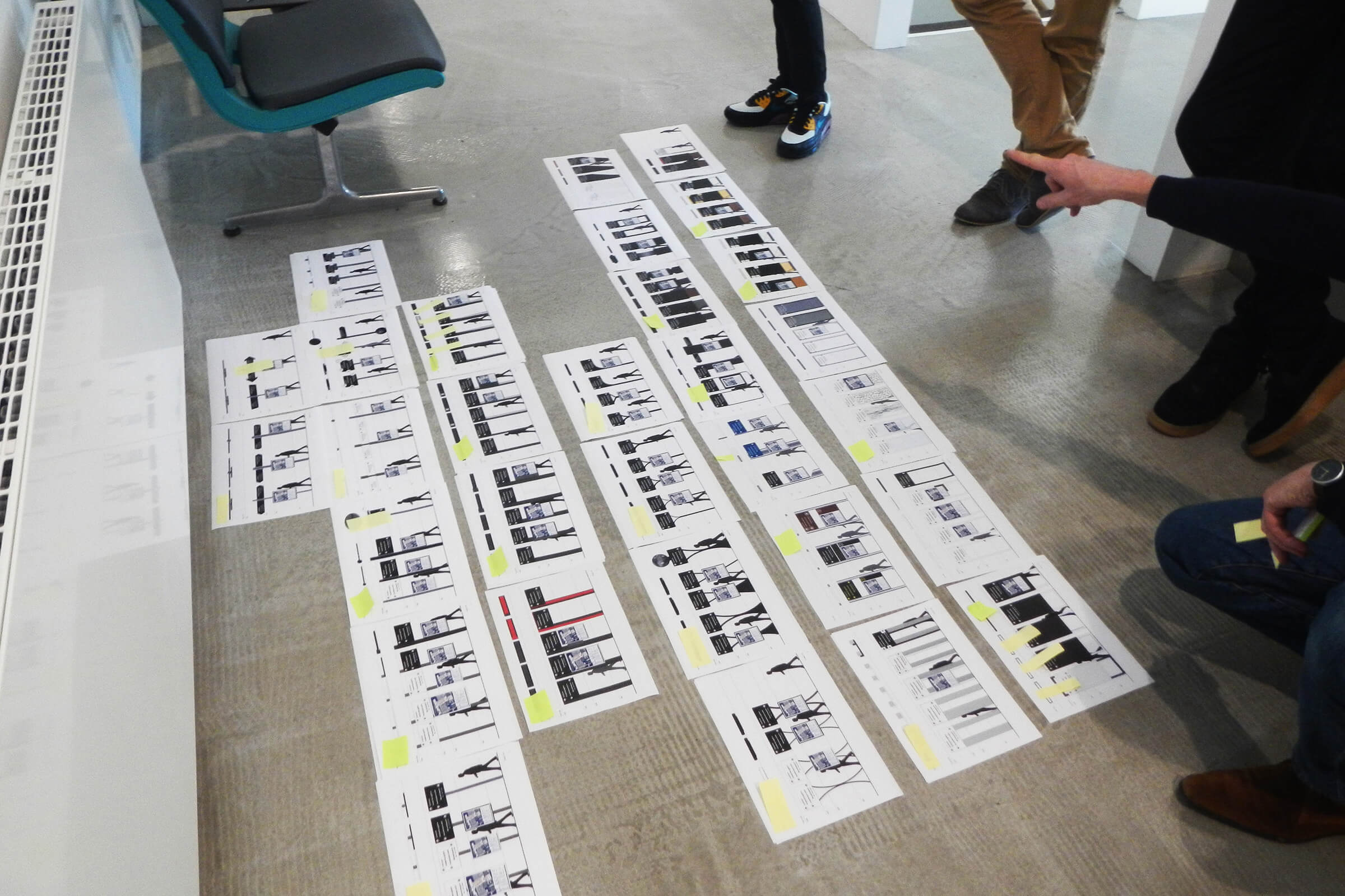
In order to make the area around the station more accessible to pedestrians, we have developed a wayfinding system in collaboration with the municipality of Utrecht.
Station area
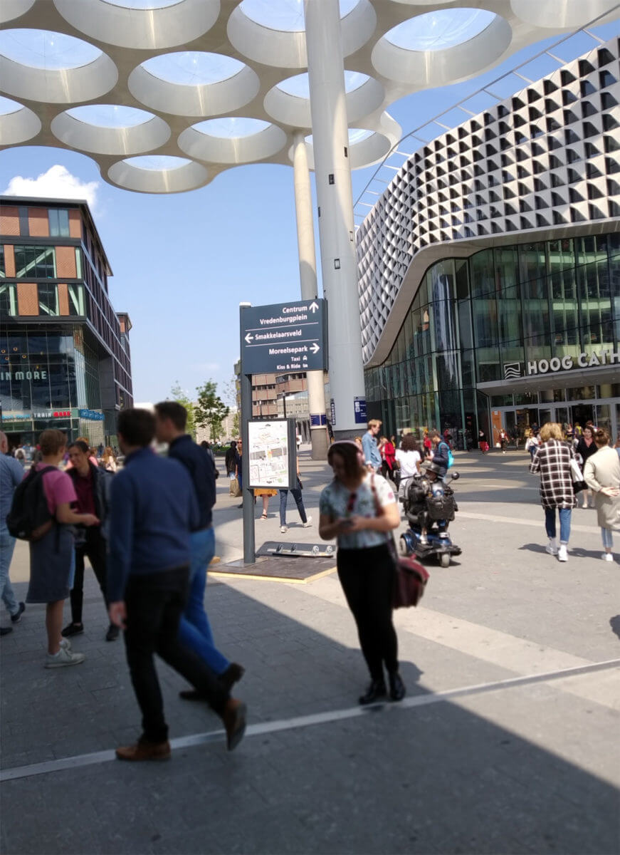
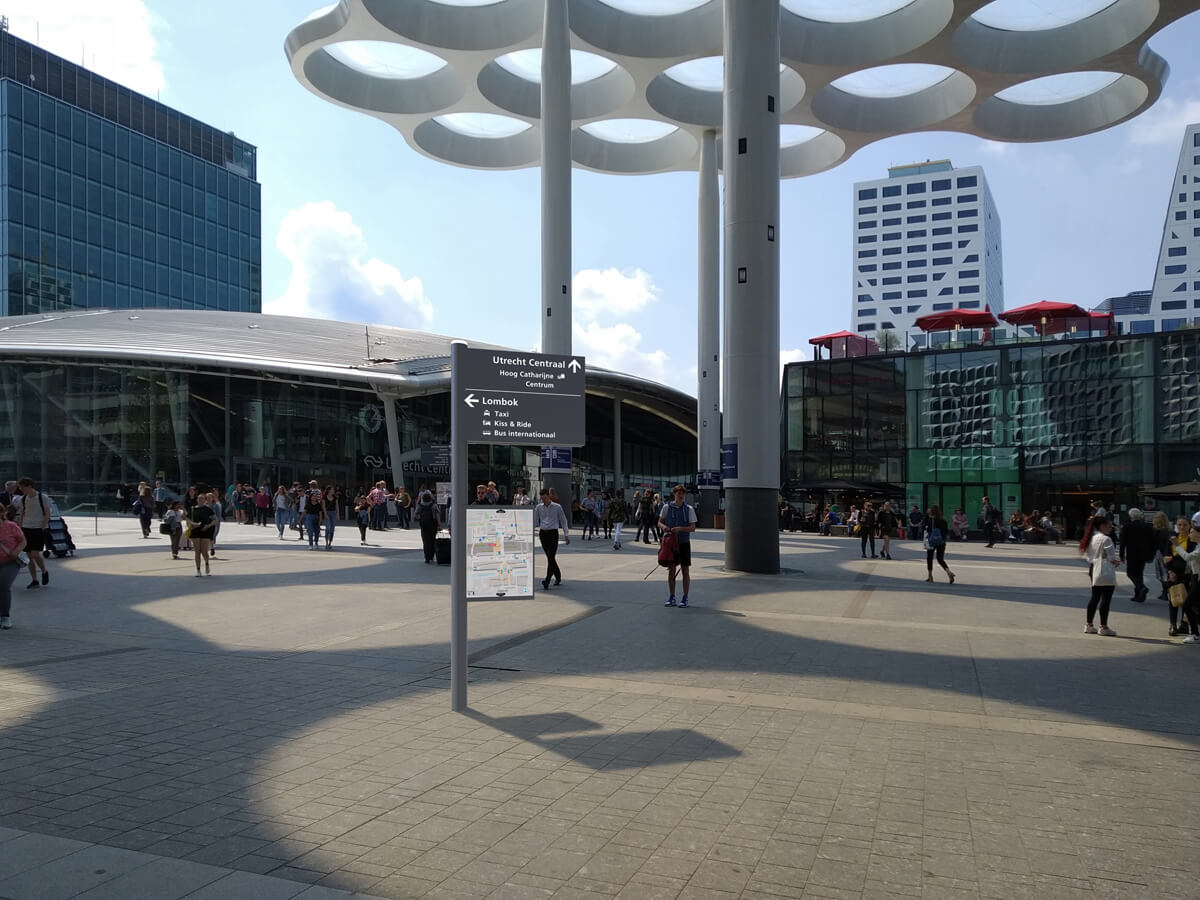
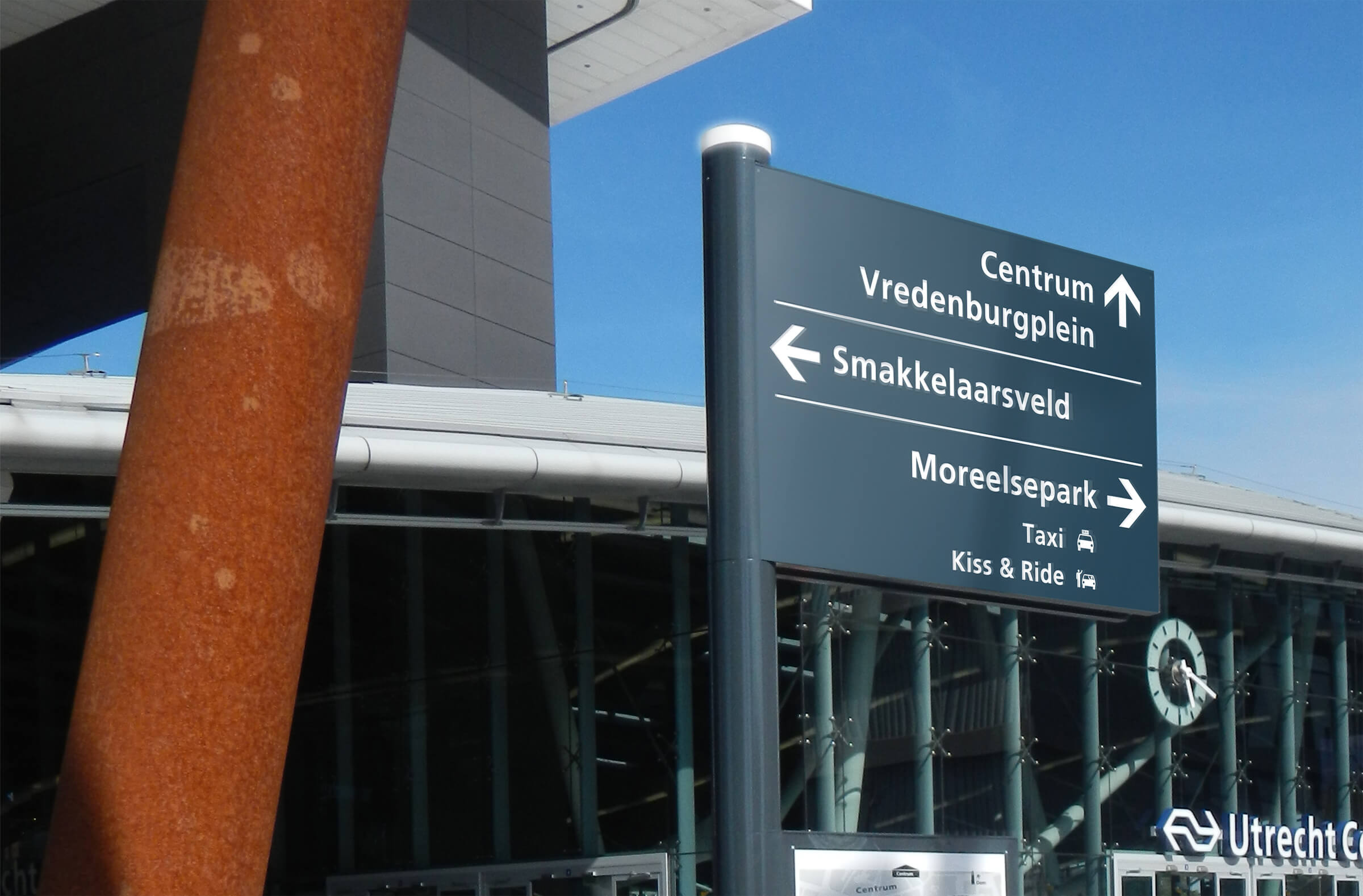
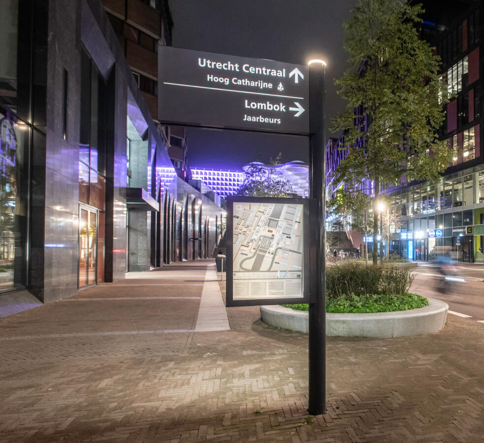
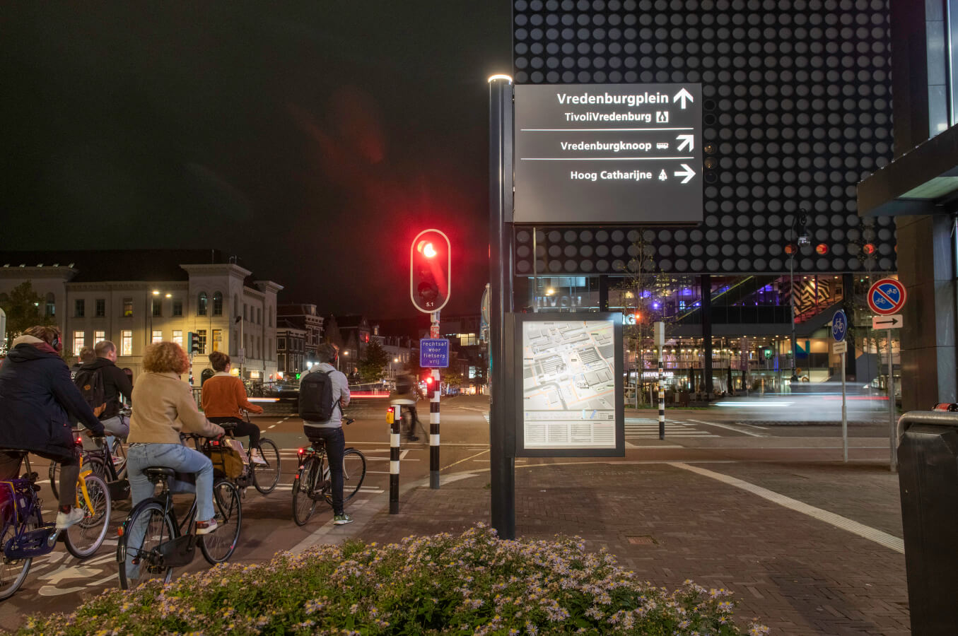
We have designed station signage for the area immediately around Utrecht Central Station. All major destinations and boarding points for tram, bus and taxi are listed. A station or area map is added to approximately half of the station signage objects. The wayfinding signs and maps are illuminated thereby making them visible and legible in the evenings.
The design of the station objects is neutral and timeless. For the unknown traveller the station objects will facilitate in orientation and walking route. For the familiar traveller they will blend in nicely with the existing objects in the station area.
City centre area
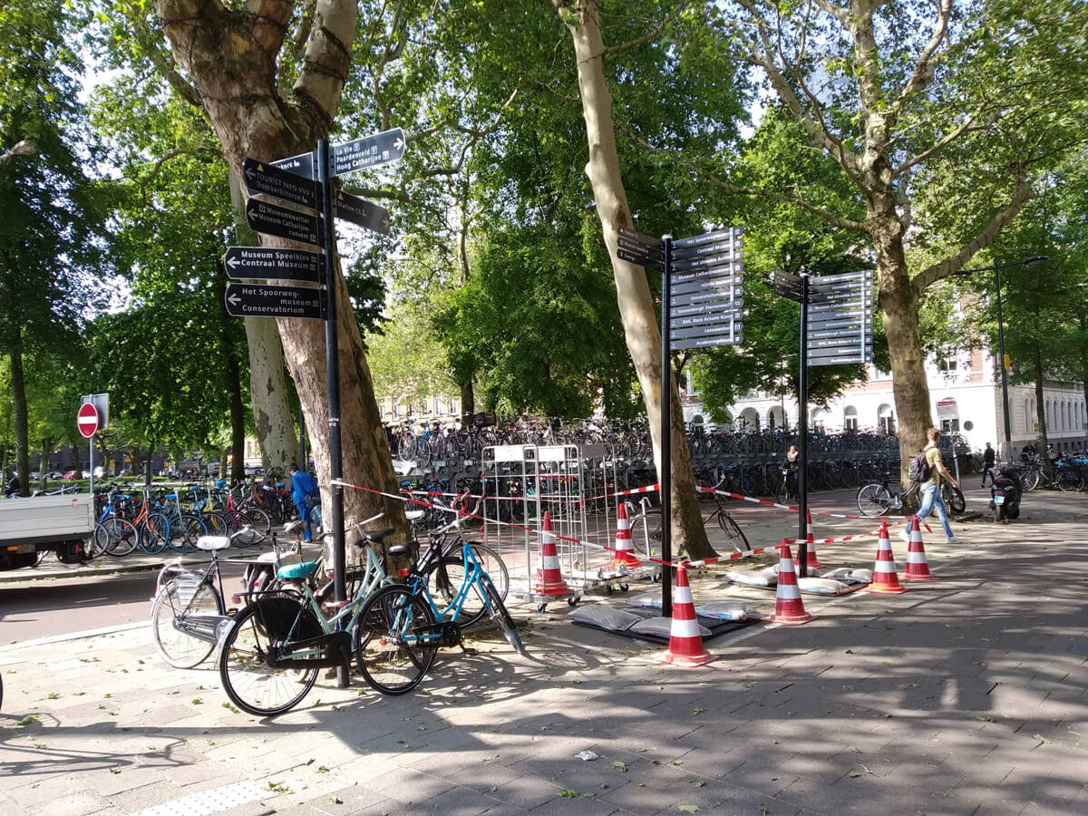
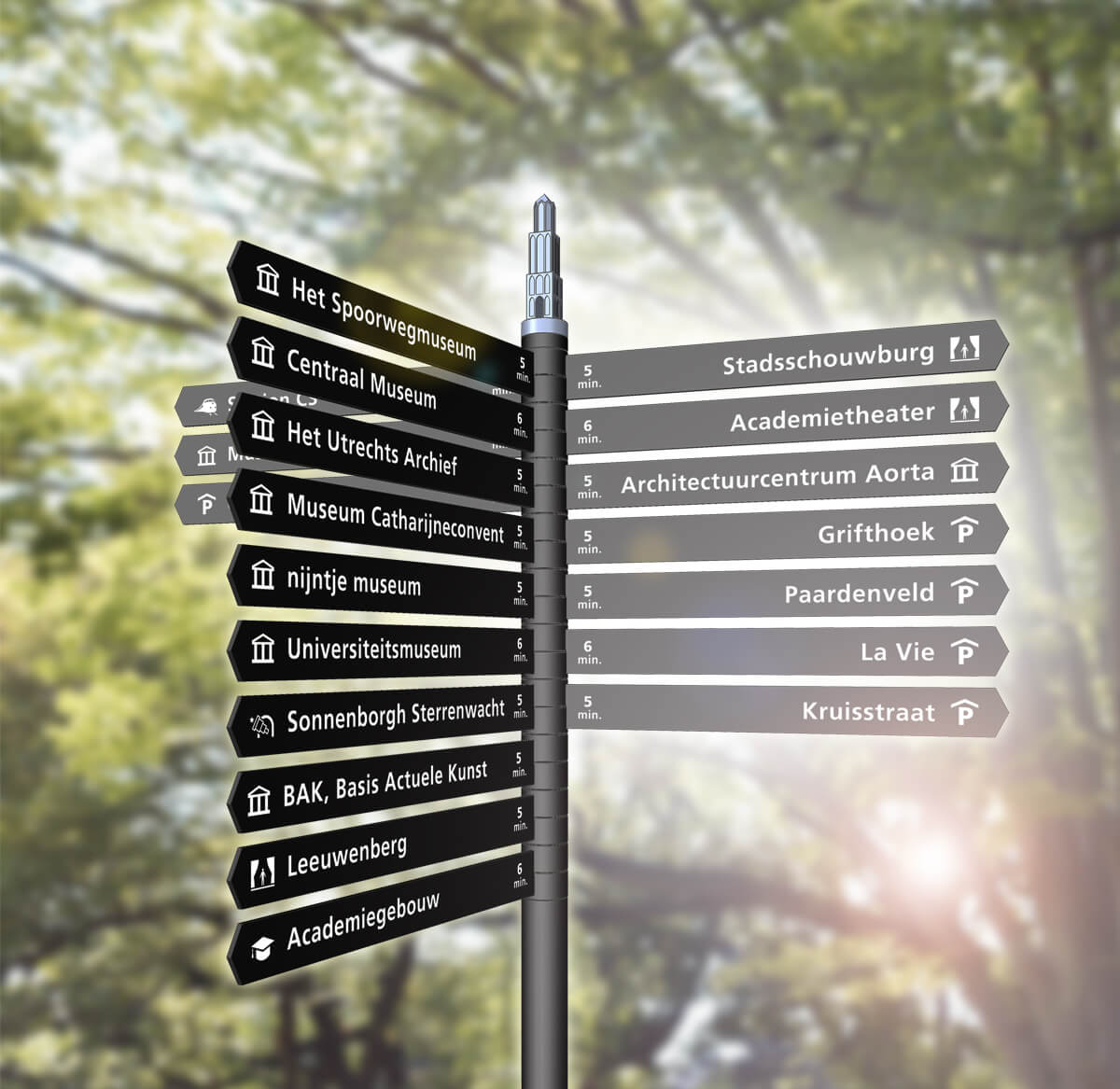
Currently there are circa 60 pedestrian wayfinding objects in the city centre of Utrecht. These objects help pedestrians on their way to major destinations. In addition to the station signage objects we have made a new design for the current wayfinding objects.
The new wayfinding objects have a contemporary look, nevertheless they still fit the historic character of the city centre. The readability of the destinations has been improved, by using a separate sign for each destination, with only one line of text. Besides that, the walking time is displayed for each of the destinations. Each separate sign can be replaced for intenance. The same font and icons are used on the city wayfinding objects as on the station signage objects.
Mock-up test
To test whether the wayfinding objects meet all requirements, we have made mock-up models of both the wayfinding objects. We have placed these 1:1 scale objects on location. Through a survey we have gathered information about the readability, visibility, use and design. This quantitative analysis, conducted by Mobycon, showed that travellers and visitors appreciate the new signage.
