Client
Province of Noord-Holland
OV-bureau Randstad
Services
Branding
Product design
Graphic design
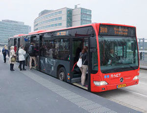
R-Net
R-net is the high-quality public transport network for the Randstad. Reliable, recognizable and coherent. The network connects various public transport lines with other modes of transport such as bicycles and cars by using hubs. R-net stands out for its high-quality level, higher than other city and regional transport. It is faster and offers direct connections with large transport flows and smooth transfer options with smaller transport flows.
FromAtoB has developed a high-quality brand identity that is visible throughout the ‘journey of the commuter’. From information at home and on the road, from dynamic travel information to the station’s spatial planning, platform furniture and vehicle design. We prefer not to speak of branding, but rather of a product formula. Because we have designed products, such as bus stops, platform furniture and DRIS panels as well.
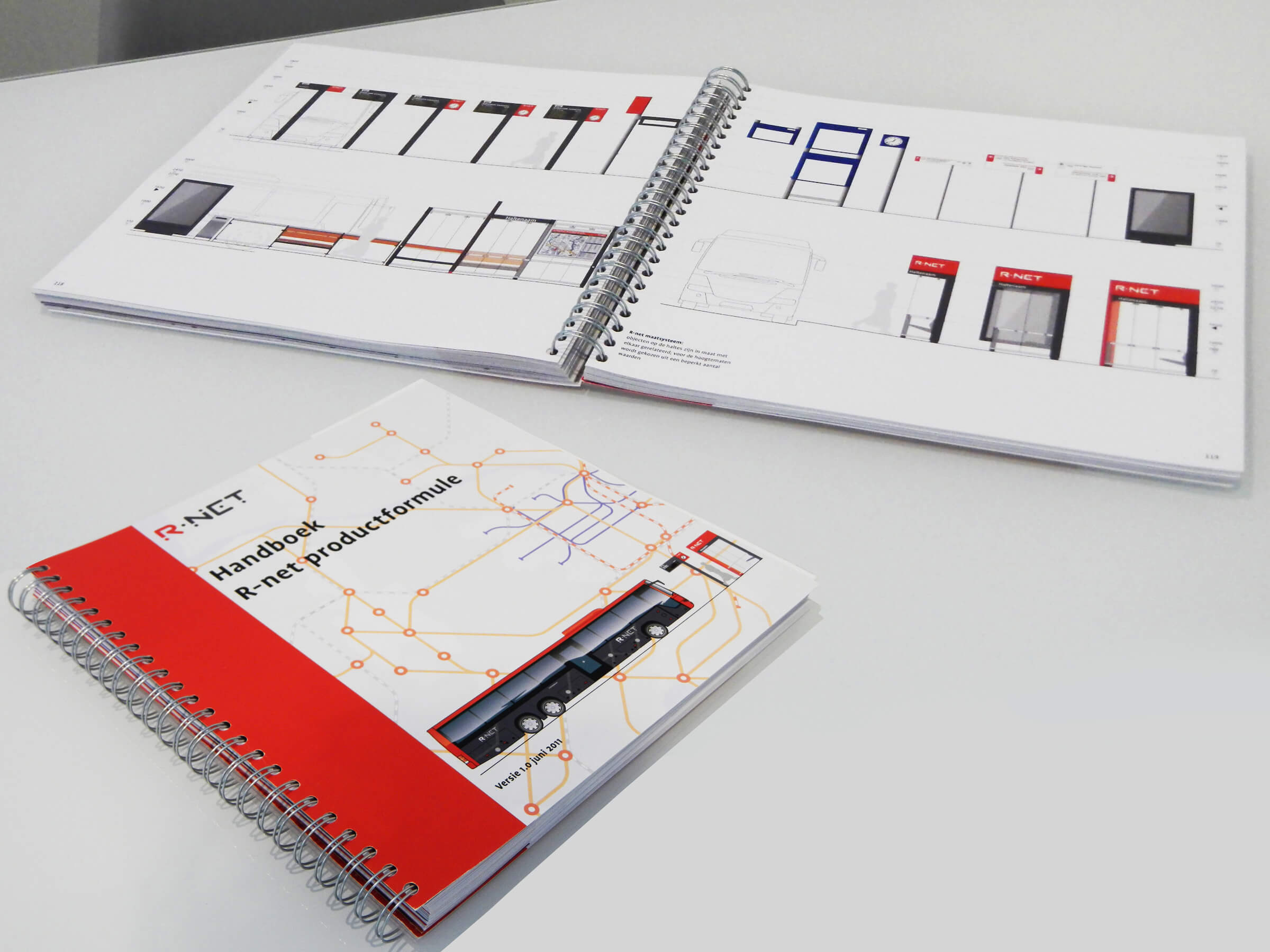
Manual
The complete product brand book includes core values, guidelines and definitions of 2D elements and 3D products. The first edition appeared in 2011, the second in 2013.
Branding R-net
The logo consists of dots, the dots can be seen as different places, like work or home. The lines between these circles stands for the connecting lines of the network. In addition to the logo, we have designed illustrative elements that can be applied to objects and presswork.
The dot pattern is based on the R-net logo. the pattern consists of dots that form the letters of the logo.
The line network pattern is a simplified representation of the network map. With horizontal, vertical and diagonal lines for the connections and dots as junctions. The pattern is used in the stickers on the exterior of the vehicles, glass screens in the interior of the vehicles and presswork.
This website uses cookies to improve your experience while you navigate through the website. Out of these cookies, the cookies that are categorized as necessary are stored on your browser as they are essential for the working of basic functionalities of the website. We also use third-party cookies that help us analyze and understand how you use this website. These cookies will be stored in your browser only with your consent. You also have the option to opt-out of these cookies. But opting out of some of these cookies may have an effect on your browsing experience.
Necessary cookies are absolutely essential for the website to function properly. This category only includes cookies that ensures basic functionalities and security features of the website. These cookies do not store any personal information.
Any cookies that may not be particularly necessary for the website to function and is used specifically to collect user personal data via analytics, ads, other embedded contents are termed as non-necessary cookies. It is mandatory to procure user consent prior to running these cookies on your website.